
Improve your numbers with periscopeUP
Data analysis has many important implications for your business, so hopefully you’re “diving into” your data on a regular basis. This is often when you’ll find new insights, or find evidence to back up your theories or assertions. A single piece of data is simply a number, but when you start tracking, comparing or grouping several pieces of data a story will often take shape. In this way, data can be a powerful component of your content marketing strategy. Data trends and comparisons with industry benchmarks can also inform business direction and decisions.
Data analysis is the underpinning of every project we take on. Find out how data can inform your business decisions. Call us at (443) 475-07787 or Contact Us online.
Not All Data Is Equal
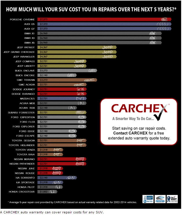
When researching data, it’s important to consider if it’s a primary source or secondary source. Primary source consists of first-hand information, such as company data or data collected and shared directly by a partner or other organization. You could even create your own primary source data by conducting or sponsoring a survey. Here’s an example of an infographic we created for a client using proprietary, primary source data:
Secondary source refers to data that has been interpreted, summarized and/or analyzed by another individual or organization. In some cases, secondary source data can be easier, faster or less expensive obtain than primary source. With either primary or secondary source data, it’s important to understand how the data was collected and reported so that you don’t misinterpret or manipulate the results. And, don’t forget the “gut check” – try to validate any data that seems unreasonable or any source that seems untrustworthy.
The Chicken Or The Egg?
Which is the right approach: develop an article topic and then look for data to support your concept, or create content around some interesting data that you’ve uncovered? There’s no right answer here, both paths can result in an insightful piece of content. Just be sure you’re relaying the story that the data actually tells and not your own version.
How To Use It
Instead of simply quoting stats, consider creating a visual interpretation of your data to include with your content. This could be in the form or a chart, graph or infographic. In all cases, be sure to consider the story you’re trying to tell and your audience.
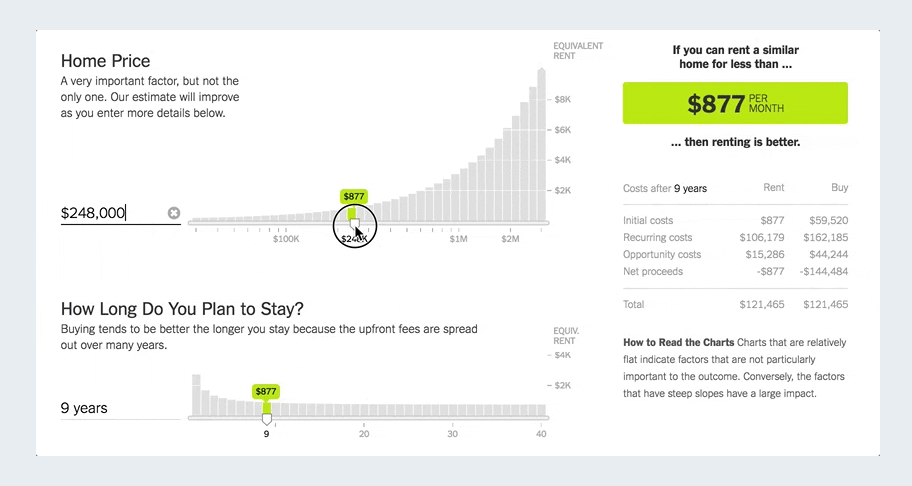
Here’s an example of an effective data visualization from the NY Times designed to help readers determine if it would be more advantageous for them to rent or buy a home:
Here’s an example of a static visualization from Mashable illustrating average temperature change throughout the world in 2016 compared to a base period (1951-1980):

Where To Find Interesting Data
There are many great data sources out there to inspire and emphasize your content. Here are a few free sources you may want to check out:
- Amazon Web Services datasets – public data on a variety of topics from Wikipedia traffic to the human genome project.
- Data.gov – U.S. government open data on a variety of topics from public safety to the environment.
- Google Finance – stock market data from the past 40 years.
- Google Trends – relative popularity of different search terms over time.
- Guardian Data Blog – curated data and charts on a variety of topics from The Guardian.
- HubSpot Research – original and curated sales, marketing and business data.
- MarketingCharts.com – curated marketing data.
- MarketingProfs.com – both original and curated marketing stats and case studies.
- National Centers for Environmental Information – climate and weather-related data.
- Nielson – original data on entertainment and music trends.
- Pew Research Center – original research for economic and political stats.
- United States Census Bureau – U.S. population and demographic information.
- SuburbanStats.org – curated demographic data organized by geographic areas.
- World Bank – global development data.
- World Health Organization (WHO) – data and analyses of health-related topics.
Refresh your content marketing strategy. Call us at (443) 475-07787 or Contact Us online for an in-depth review of your organization’s data trends and industry benchmarks.