How To Tell A Story With Data
Last week, Google Analytics revealed a pretty substantial upgrade, not just a facelift, because this change is more than cosmetic. It’s truly a deep-down shift in the way we marketers need to think about analytics going forward.
In this post, I will review the changes, why I think they were made (not that Google consulted me on this…unfortunately), and whether this is an evolution or just a shake-up for the end user.
Google Analytics Finally Heeds Avinash, Its Most Outspoken Spokesperson
You’re probably aware of the world’s only web analytics rockstar Avinash Kaushik. He’s been preaching that we should think of analytics & create reports based on three distinct stages of user engagement:
1. Acquisition (how you get traffic)
2. Behavior (what visitors do once you get them)
3. Conversions, AKA Outcomes (which traffic delivers on your business goals; leads or purchases)
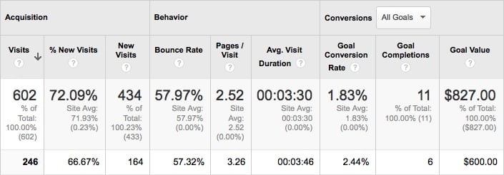
Acquisition metrics by Default Channels. Follow your Visitors’ journey to better understand their stories.
Guess what? That’s exactly how Google has reimagined Google Analytics…
The New Left Side Navigation
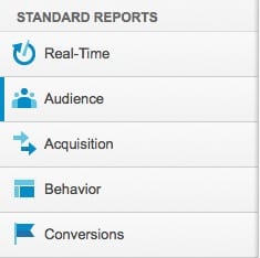
The new left navigation of Google Analtyics.
Let’s break this down by looking at the new left sidebar navigation, and it will all make sense. Trust me.
- At the top level, you still have Audience – the people on your site – where they come from geographically, what device they use to view your site, when and how often they visit, etc.
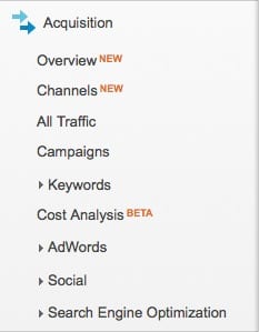
- Next is Acquisition – where visitors come from and how each source of traffic is performing. This set of reports is expanded in the screenshot below because it’s changed substantially. Gone is “traffic source,” replaced by “channels.” Social, SEO, AdWords, Campaigns, all these reports that were spread out all over the place have been unified in a much more logical way.
- Next is Behavior – What are people doing on the site? Leaving immediately, looking around, downloading documents, interacting with content?
- Last is Conversions, AKA Outcomes – Who is converting, becoming a lead, buying product?
Why The New UI Is A Boon (Despite Yet Another Learning Curve)
Google Analytics’ now-retired UI did the job because we were used to it, but truthfully it had been pieced together over time to accommodate big changes in the Internet (social media, mobile devices and tablets, and Google’s changing business model ( (not provided) hiding organic keywords, for example.). At some point, all this cobbling together resulted in a Platypus,. Google teared it down to dream it all up again.
This redesign forces us to reevaluate how we interpret our website data. But by providing a simple structure to data (people, how we get them, what they do, who acts), we can examine this information within a logical context. Google Analytics can now better help us understand our Visitors, and how good a job our websites are doing of meeting their needs and engaging them with our brands.
Moving ahead, we suggest you try to adopt the following philosophy to drive your agency or business to new levels of success using Google Analytics’ refreshed UI:
>Acquisition > Behavior > Conversions/Outcomes
…and at the heart of it all is the Visitor.
Note: Google Analytics Isn’t Stopping With UI
Other major changes have already started rolling out in Google Analytics, including radical modifications to the Admin area and Advanced Segments. Keep an eye out for more useful tools.